Composing widgets
This tutorial will describe how to make new widgets that combine several existing widgets. This is a good way to reuse common arrangements of widgets (i.e. a checkbox with a label next to it, a message with a picture of the character who sent it, a dialog box with an error icon, etc). It’s also a good way to encapsulate all the logic for higher-level widgets (i.e. a panel with graphics or audio settings, a file-chooser dialog, a splash screen to show while a level is loading, etc).
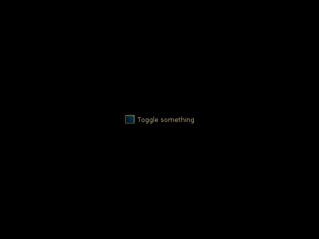
We’ll focus specifically on the example of making a checkbox with a label next to it. To begin, here is how you would make such a checkbox without creating a new widget:
class WesnothLabel(glooey.Label):
    custom_font_name = 'Lato Regular'
    custom_font_size = 10
    custom_color = '#b9ad86'
    custom_alignment = 'center'

class WesnothCheckbox(glooey.Checkbox):
    custom_checked_base = pyglet.resource.image('checked_base.png')
    custom_checked_over = pyglet.resource.image('checked_over.png')
    custom_checked_down = pyglet.resource.image('unchecked_down.png')
    custom_unchecked_base = pyglet.resource.image('unchecked_base.png')
    custom_unchecked_over = pyglet.resource.image('unchecked_over.png')
    custom_unchecked_down = pyglet.resource.image('unchecked_down.png')

hbox = glooey.HBox()
checkbox = WesnothCheckbox()
label = WesnothLabel("Toggle something")

hbox.pack(checkbox)
hbox.add(label)
hbox.alignment = 'center'
hbox.padding = 6
composing_widgets/separate_widgets.pycomposing_widgets/separate_widgets_assets.zip
Basic implementation
To make this into a self-contained widget, we need to derive a new class from
Widget. Within the constructor of this class, we can create and configure
the HBox, Checkbox, and Label widgets the same way as before. Then we
just need to use the _attach_child() method to attach the HBox to
our new widget (rather than to the GUI):
class WesnothLabeledCheckbox(glooey.Widget):
   custom_alignment = 'center'

   def __init__(self, text):
       super().__init__()

       hbox = glooey.HBox()
       self.checkbox = WesnothCheckbox()
       self.label = WesnothLabel(text)

       hbox.pack(self.checkbox)
       hbox.add(self.label)
       hbox.padding = 6

       self._attach_child(hbox)

window = pyglet.window.Window()
gui = glooey.Gui(window)
checkbox = WesnothLabeledCheckbox('Toggle something')
gui.add(checkbox)
composing_widgets/labeled_checkbox.pycomposing_widgets/labeled_checkbox_assets.zip
The most unfamiliar part of this code is the call to _attach_child().
You can think of this method as the behind-the-scenes version of the add()
methods that containers like HBox, VBox, and Grid have. More
specifically, it makes the given widget (hbox in this case) a child of the
widget that the method is being called on (self in this case). Child
widgets are placed and drawn relative to their parents, and parent widgets are
obligated to make enough room for all their children.
The leading underscore in _attach_child() indicates that this method
is not part of the public Widget interface. In other words, you shouldn’t call
this method unless you’re writing a widget class. The reason is that most
widgets don’t know how to handle having children attached to them. Those that
do provide public methods like add() that attach children and keep track of
what to do with them.
Polished implementation
Although the basic implementation achieves its goal of making labeled
checkboxes reusable, there are a few ways it could be more idiomatic and
user-friendly. First, it could allow subclasses to control the specific
Checkbox and Label widgets that it uses, and the
spacing between them. We can accomplish this by making HBox, Label, and Checkbox inner classes. Second, it could toggle
the checkbox in response to clicks anywhere in the widget. Third, it could
mimic more of the checkbox interface, so users wouldn’t need to know about the
underlying checkbox. None of these improvements are really central to the
topic of how to make a composite widget, but I think it’s worth seeing a more
polished implementation:
class WesnothLabeledCheckbox(glooey.Widget):
    Label = WesnothLabel
    Checkbox = WesnothCheckbox
    custom_alignment = 'center'

    class HBox(glooey.HBox):
        custom_padding = 6

    def __init__(self, text):
        super().__init__()

        hbox = self.HBox()
        self.checkbox = self.Checkbox()
        self.label = self.Label(text)

        hbox.pack(self.checkbox)
        hbox.add(self.label)

        # Configure `checkbox` to respond to clicks anywhere in `hbox`.
        self.checkbox.add_proxy(hbox, exclusive=True)

        # Make the `on_toggle` events appear to come from this widget.
        self.relay_events_from(self.checkbox, 'on_toggle')

        self._attach_child(hbox)

    def toggle(self):
        self.checkbox.toggle()

    def check(self):
        self.checkbox.check()

    def uncheck(self):
        self.checkbox.uncheck()

    @property
    def is_checked(self):
        return self.checkbox.is_checked

WesnothLabeledCheckbox.register_event_type('on_toggle')
composing_widgets/polished_labeled_checkbox.pycomposing_widgets/polished_labeled_checkbox_assets.zip
Why not inherit from HBox?
Another tempting way to create a LabeledCheckbox widget is to inherit from
HBox. This avoids the unfamiliar _attach_child() method and
is even a little more succinct than the code above:
class WesnothLabeledCheckbox(glooey.HBox):
   custom_alignment = 'center'
   custom_padding = 6

   def __init__(self, text):
       super().__init__()

       self.checkbox = WesnothCheckbox()
       self.label = WesnothLabel(text)

       self.pack(self.checkbox)
       self.add(self.label)
The problem is that this inherits a lot of unwanted functionality from HBox,
namely public methods to add new widgets and remove existing ones. In some
cases this might be what you want; there are certainly good applications for
inheriting from containers like HBox. But it doesn’t make sense for a
labeled checkbox to have methods that can get rid of both the label and the
checkbox, so for this application it’s better to inherit from Widget.
Attaching multiple children
In the previous two labeled checkbox implementations, we only attached the
HBox directly to our new widget. We then proceeded to attach the actual
label and checkbox to that HBox. What if we wanted to leave out the HBox
and just attach both the label and checkbox directly to our widget?
This approach turns out to be more complicated and more powerful than you might expect. The reason is that widgets are responsible for positioning and making room for all of their children. In the case where a widget has only one child, we don’t have to worry about these responsibilities because there is a reasonable default: make the child the same size and shape as the parent. In the case where a widget has multiple children, there is no default: we have to explicitly define how much space our widget needs to fit its children and how its children should be positioned within that space.
The upside of this added responsibility is that we can arrange the children in
absolutely any way we like. It follows that you should only write widgets like
this when none of the existing containers do what you want, or when you’re
making a new container. (Hopefully neither scenario is common.) Writing a
labeled checkbox like this is overkill because it basically means writing a
poor-man’s version of HBox. But we’re going to do it anyway, and hopefully
you’ll find it easy to apply the ideas in this example to widgets that might
need them more:
class WesnothLabeledCheckbox(glooey.Widget):
    custom_alignment = 'center'
    custom_label_padding = 6

    def __init__(self, text):
        super().__init__()

        self.checkbox = WesnothCheckbox()
        self.label = WesnothLabel(text)

        self._attach_child(self.checkbox)
        self._attach_child(self.label)

    def do_claim(self):
        width = sum((
                self.checkbox.claimed_width,
                self.custom_label_padding,
                self.label.claimed_width,
        ))
        height = max(
                self.checkbox.claimed_height,
                self.label.claimed_height,
        )
        return width, height

    def do_resize_children(self):
        checkbox_rect = self.checkbox.claimed_rect
        checkbox_rect.left = self.rect.left
        checkbox_rect.center_y = self.rect.center_y

        label_rect = self.label.claimed_rect
        label_rect.left = checkbox_rect.right + self.custom_label_padding
        label_rect.center_y = self.rect.center_y

        self.checkbox._resize(checkbox_rect)
        self.label._resize(label_rect)
composing_widgets/multiple_children.pycomposing_widgets/multiple_children_assets.zip
The constructor is a little simpler than before. Now we just have to create
the label and the checkbox and attach them both to the new widget. The work of
positioning those two widgets falls to do_claim() and
do_resize_children().
The do_claim() method returns the minimum width and height our
widget needs to fit all of its children. This example needs enough width to
fit label and the checkbox side-by-side, but only enough height to fit the
taller of the two. The minimum sizes of the child widgets, which are important
for this calculation, can be accessed via their claimed_rect,
claimed_width, and claimed_height attributes.
The do_resize_children() method actually sets the sizes and
positions of all the children. It does this by calling the
_resize() method on each one. This method expects a rectangle
in the form of a vecrec.Rect object (the same type of object returned by
Widget.claimed_rect). This rectangle may be larger than the widget’s claimed
size, but it cannot be smaller.